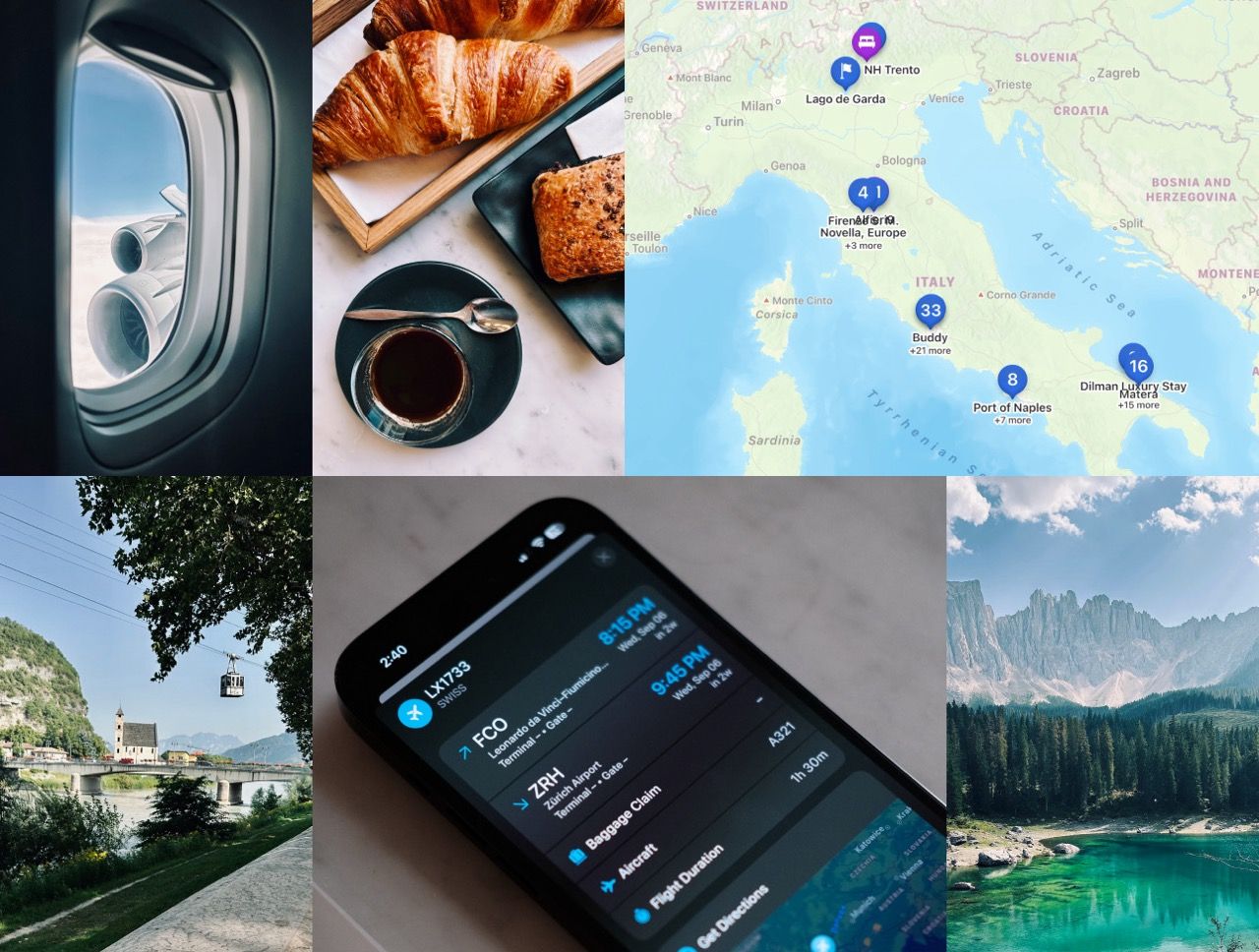
Sure, it might sound like a blast to say you need to travel to test a travel app, but the reality is that some journeys can be far more complex than we initially realize. While some folks may simply require a flight and a hotel, with the rest of their days spent lounging at a luxurious resort, there are those whose adventures involve a mix of transportation methods, a variety of activities, routes, and diverse accommodation options. To truly grasp this diversity, we must immerse ourselves in these journeys.
Complex trips demand meticulous planning and unwavering dedication to prevent wasting precious time at your destination or, worse yet, losing money due to missed flights or trains. This year, I embarked on one of the most extensive trip of my life, crossing Italy from the southern tip to the northern border while putting a new release to the test.
A journey on trains stations
Let's kick things off with Italian trains, renowned for their high-speed and ease of city-hopping offerings. Italy boasts an extensive network of train routes, enabling travelers to explore various destinations, including charming small towns. While trains are generally punctual, with only occasional minor delays, the platform announcement often occurs mere minutes before arrival. Thus, it's crucial to keep the train information handy to swiftly locate your departing train.

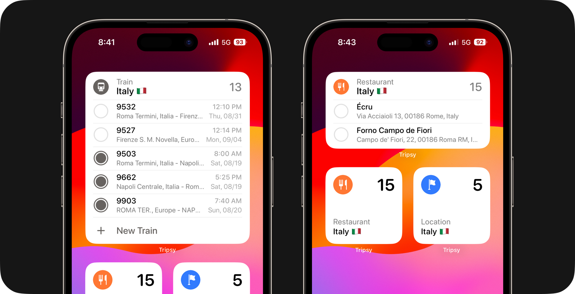
In the latest release, we're thrilled to introduce a set of brand-new lock screen widgets. These widgets were designed to provide context-specific information for various activities.
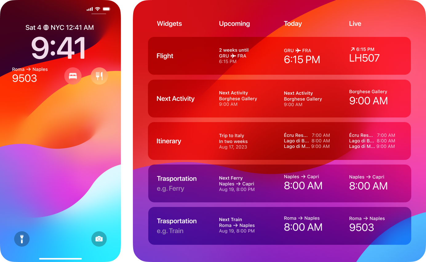
Even if you engage in various activities, our lock screen widgets will identify the most important information to display. For instance, during a train trip, the widgets will initially show you the train's departure time throughout the day. However, a few minutes before departure, the train number will be prominently displayed, aiding you in quickly locating the correct platform. Streamline your travel experience with our intuitive lock screen widgets.
Tip: During this journey through Italy, we took around 14 train trips. I used one of our best features, Tripsy Automation, to keep this organized. I just forwarded all reservations to my@tripsy.app, and my entire itinerary was automatically organized, attaching all train reservations to the activities.
Instant access to essential information
The European summer leaves train stations crowded and with large groups of people, so whenever possible, we preferred to arrive at stations earlier to go calmly to the boarding platform.
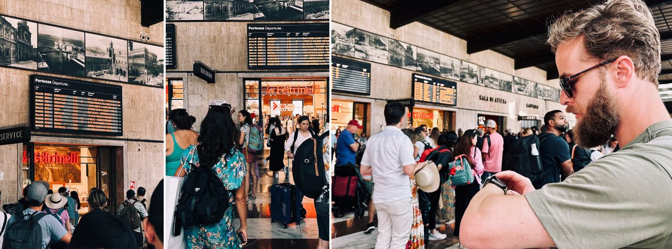
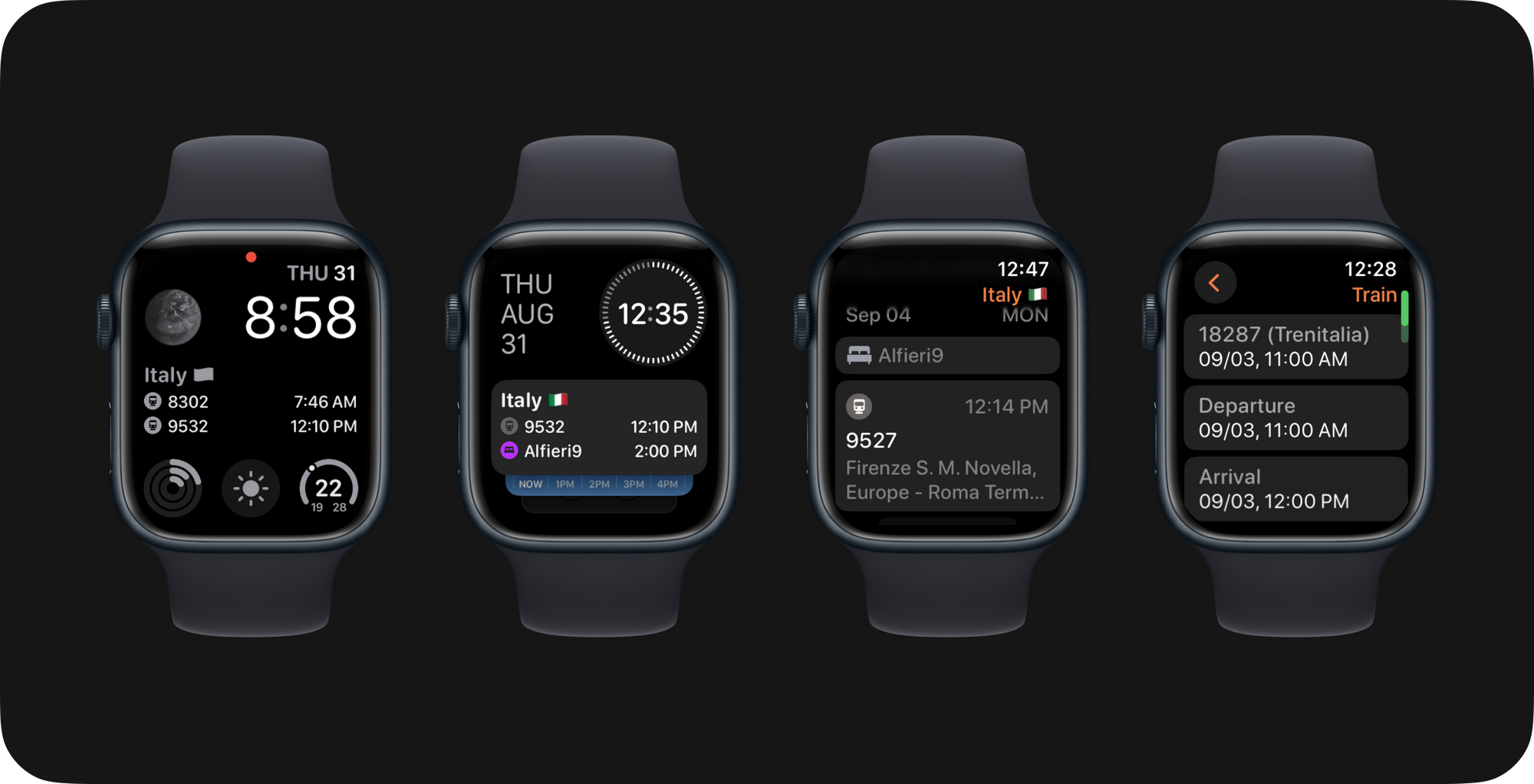
As trains return to the same stations, carriages often arrive with their positions reversed, making it crucial to have your ticket details readily available to identify your assigned carriage. While checking your ticket details can be simple, it becomes even more convenient when you have them accessible on your Apple Watch.
In this latest version of Tripsy for Apple Watch, we've enhanced the itinerary widget for watch faces and introduced a new widget for the smart stack. Furthermore, we've expanded the range of information displayed in activity details. This means that during your journey, you can effortlessly access all the ticket details you need, right from your Apple Watch.
So many places to visit!
During a 22-day trip, the sheer volume of plans can be overwhelming. So far, I've bookmarked 26 restaurants, 10 cafes, 7 sites and parks, joined one tour, and 3 museums. I'm still tallying up my transportation, which includes 14 train journeys, 4 bus rides, and 2 ferry crossings. Even though I'm moving across different cities, I prefer to keep everything organized as one cohesive trip, ensuring that all my essentials are easily accessible.

With a huge number of activities, we noticed that it took a lot of work to navigate the map and showing the routes simultaneously. We then created a setting for the map where you can turn off flight or transport routes to avoid interfering with your navigation.
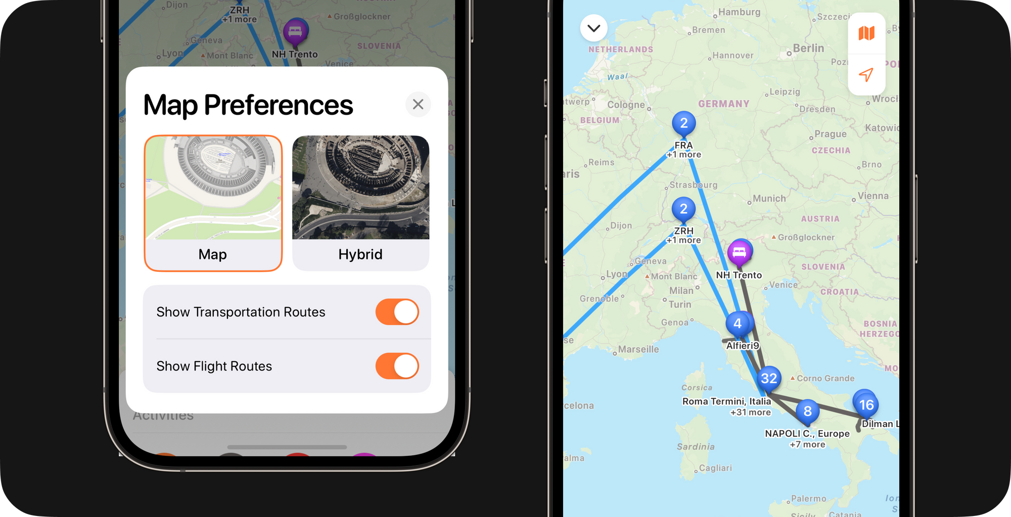
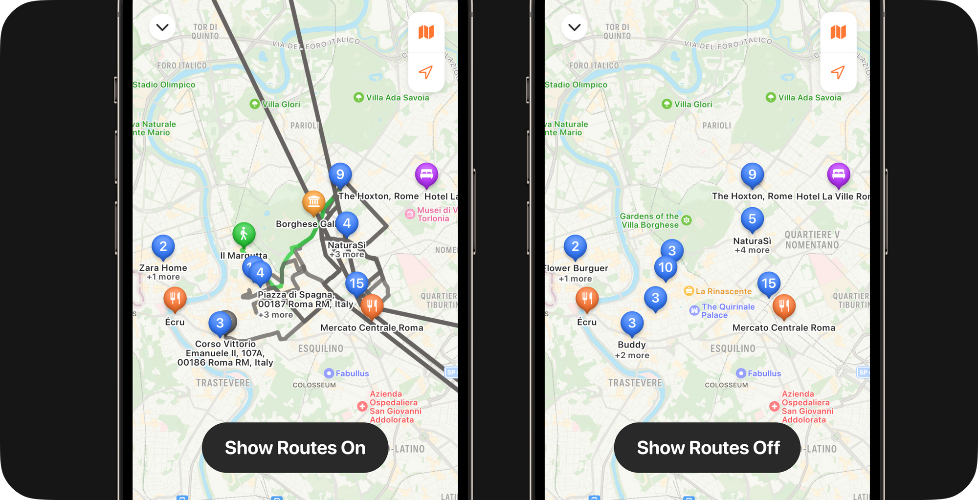
Now the app is also always displaying the places you’re staying, even if you’re only filtering for a unique category. That helps you get a sense of the distance from your lodging to the activity.
Take into what has already been done
I prepared for my trip by setting up a focus mode and customizing my iPhone's Home Screen. I only kept the necessary apps within easy reach and added various Tripsy widgets! By doing this, I created shortcuts for the activities I needed to access quickly and could get information without opening the app.
For Tripsy 2.17, we also added the new interactive widget that allows easy access to activity lists and checking off completed tasks.
Fixes and other minor improvements
This trip was crucial for identifying improvements, addressing user feedback, and fixing bugs. This update also include other minor things:
• Account information synced over keychain between devices. Now, when you set up a new device with Tripsy, it will automatically recognize the account and start syncing immediately with that data.
• Updated the list of available airlines and airports with much more data.
• When using our share extension from Google Maps, fetch all detailed information from the place (name, phone, website, etc.).
• Update the collaborators' calendars when someone updates the trip information or delete an entire trip.
• Update the timezone of a location when we don’t immediately have it from the search list.
• Weather was showing a location sometimes, even when the activity ends on another day.
• Fixed crash when moving an activity from a category that would be empty.
• Ignore attachments on emails that add no value.
• Fixed macOS app size based on the macOS resolution.
• Improvements to the loading state of all widgets.
We hope you enjoy this update as much as we did!
Safe travels! 🧡

